
Point of Sale Display Design for Retail Brands
· 12 min read
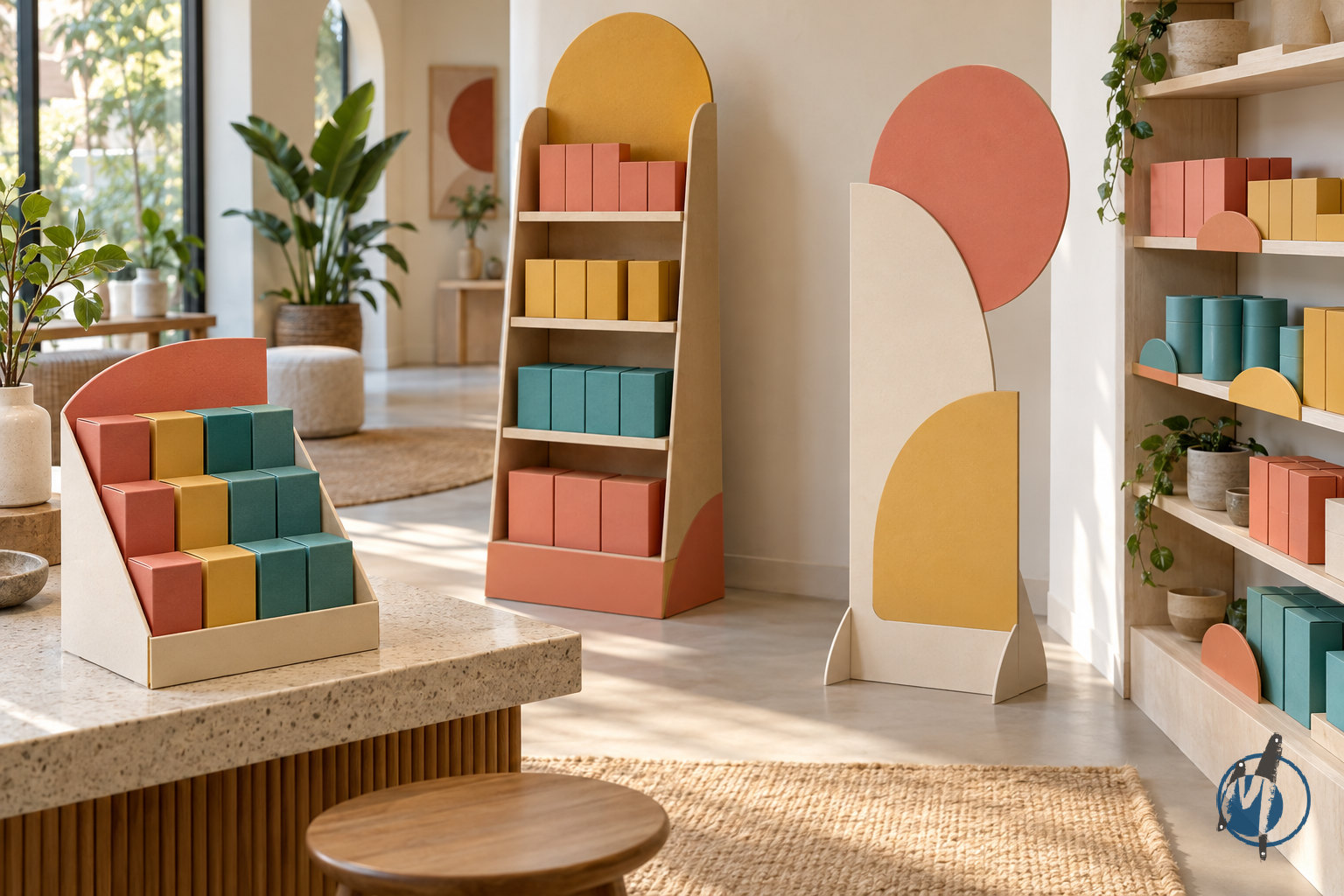
Quick answer: Point of sale display design for retail brands combines shopper messaging, physical structure, print and placement to make products easier to notice, understand and buy. Effective displays suit the store environment, support the merchandise safely and remain easy for staff to assemble and replenish. The right solution may be a counter or floor display, shelf talker, dangler, window graphic or standee—not necessarily the largest format.
What is point of sale display design, and what should it achieve?
Point of sale display design is the planning and creation of branded communication and product presentation where shoppers make purchase decisions. Although “point of sale” can mean the checkout specifically, retail teams also use it for displays across the selling floor. Point of purchase, or POP, is another common term; project briefs should define the actual location rather than rely on terminology alone.
A good display solves a specific shopping problem. It might introduce an unfamiliar product, distinguish a new variant, explain a useful benefit or make an add-on purchase convenient. A freestanding structure that looks impressive but obscures the merchandise is not doing its job. Neither is a beautifully printed shelf talker that cannot be read from the shopper’s normal position.
Start with the decision you want to support, then choose the physical format. Different objectives require different information, product quantities and placements. A discovery display may need a simple category explanation, while a checkout unit may need only a recognisable pack and a clear reason to pick it up.
Define the job before designing
Attract: Make the product or offer visible within the surrounding retail environment.
Explain: Communicate one primary benefit or reason to consider it.
Reassure: Help shoppers identify the right variant, size or application.
Enable: Make products easy to reach, lift and return without disturbing the display.
Support operations: Allow staff to replenish, clean and maintain the unit without special effort.
Treat these as priorities, not a requirement to say everything at once. A focused display usually has a clearer hierarchy than one trying to reproduce a brochure on a small surface.
Which retail display format is right for your product and store?
Format selection should follow the store location, product characteristics and campaign objective. A heavy product needs a different support system from a lightweight carton. A narrow checkout counter creates different constraints from an open promotional area. Ask for retailer permissions early: available space in a photograph is not necessarily approved promotional space.
Counter and floor displays can hold merchandise as well as communicate. Shelf talkers and danglers primarily add visibility around existing fixtures. Window graphics and standees help attract attention or introduce a campaign, but they need a clear connection to where the product can actually be found. These formats work best as a coordinated system rather than unrelated pieces of artwork.
Format | Best suited to | Key design consideration | Common limitation |
|---|---|---|---|
Counter display | Compact products and checkout add-ons | Small footprint, stable base and accessible product pockets | Can interfere with billing or staff workspace |
Floor display | Dedicated promotions and grouped merchandise | Load-bearing structure, aisle clearance and replenishment | Needs approved floor space and careful stability checks |
Shelf talker | Highlighting benefits or variants at the shelf | Attachment, legibility and alignment with the correct SKU | Can cover price labels or neighbouring products |
Dangler | Drawing attention to an aisle or promotion | Sightline, suspension method and overhead clearance | Can become visual clutter or conflict with store rules |
Window graphic | Seasonal campaigns and storefront visibility | Glass conditions, viewing direction and removal method | Reflections and backlighting can reduce readability |
Standee | Campaign awareness and navigation | Readability at approach, base stability and placement | May be moved if it obstructs shopper movement |
Build a coordinated display family
Use the same visual language across formats, but adapt the content to each viewing situation. A window graphic should not carry the same detail as a shelf-level explanation. A standee can introduce a benefit, while a shelf talker helps shoppers locate the relevant product. Consistency comes from shared hierarchy, colours and imagery—not identical layouts enlarged or reduced mechanically.
What makes a point of sale display easy to notice and understand?
Retail displays compete with packaging, price tickets, other promotions and the architecture of the store. Effective visual design establishes an obvious reading order: what the product is, why it matters and what the shopper should do next. That hierarchy should remain understandable even when someone sees only part of the display while walking past.
Choose one dominant message and make supporting information genuinely secondary. Product imagery should accurately represent what is available, while colour and typography should help separate the display from its surroundings without breaking brand identity. Claims, offer conditions and language versions need review before artwork is locked. Attractive design cannot compensate for an unclear or unsupported promise.
Design at actual size and test from the intended viewing position. A layout that looks clean on a laptop may become crowded when placed beside a full shelf. Conversely, fine print that appears readable in a close-up mock-up may disappear at normal shopping distance. For Indian retail rollouts, plan regional-language versions according to the audience and retailer requirements rather than squeezing every language onto every panel.
Establish a practical information hierarchy
Primary message: The product, campaign or main benefit.
Product connection: A visible pack, product image or unmistakable category cue.
Supporting detail: Only the information needed to make the immediate decision.
Action cue: Where to find, try, pick up or learn more about the product.
Required information: Applicable disclosures, offer conditions and other reviewed details.
A QR code can support deeper engagement, but it should not carry information essential to understanding the display. Test it on the final printed surface, with realistic lighting and a working destination. Reflective finishes, awkward positioning and poor connectivity can all disrupt the experience.

How do materials and structural design affect retail performance?
Material choice should follow the display’s working conditions, not appearance alone. Consider merchandise weight, campaign duration, handling frequency, moisture exposure and transport. Corrugated board, paperboard, rigid board, sheet plastics, metal and wood-based components offer different combinations of stiffness, finish, weight and service life. No material is automatically the best choice for every retail application.
For paper-based counter and floor displays, structural details often matter as much as substrate selection. Fold direction, internal supports, shelf spans, locking tabs and base geometry affect how the unit performs. A premium printed surface does not make an under-supported shelf safe. Test the proposed structure with the actual products and expected loading arrangement before approving production.
Check the real operating conditions
Product load: Test filled shelves, not just an empty prototype.
Uneven loading: Assess what happens as shoppers remove products from one side.
Reach and access: Ensure shoppers can lift products without catching adjacent packs.
Wear points: Review exposed edges, folds, handles and replenishment openings.
Cleaning exposure: Consider damp floors and cleaning activity near the base.
Attachment: Confirm shelf clips, adhesives or suspension hardware suit the fixture.
India-wide distribution can expose displays to varied humidity, storage and handling conditions. Record those assumptions in the brief rather than treating them as exceptions. For window graphics, check the glass surface, interior or exterior application, sun exposure and adhesive suitability; some glazing systems have film restrictions that should be confirmed with the relevant supplier.
How should a retail brand brief its display design partner?
A useful brief combines commercial intent with physical facts. “Make it premium” is a direction, not a specification. Explain which shopper decision the display should influence, how the product is positioned and where the unit will sit. Include photographs of the actual store environment, with measurements and any retailer-issued fixture guidelines.
The product itself is essential design input. Supply physical samples where possible, along with packed dimensions, weights, variant information and the desired display quantity. If packaging is still changing, identify that risk immediately. A small change to pack depth can affect pocket fit, shelf capacity, print layout and shipping dimensions.
Retail display briefing checklist
Campaign objective and intended shopper action.
Store types, installation locations and retailer permissions.
Available footprint, height restrictions and fixture measurements.
Product samples, dimensions, weights and SKU mix.
Required stock capacity and replenishment approach.
Brand guidelines, approved assets and reviewed messaging.
Language versions and regional artwork requirements.
Campaign duration and expected environmental conditions.
Quantity by format, destination and artwork version.
Budget parameters, launch date and approval responsibilities.
Packing, assembly, installation and removal expectations.
Success measures and any planned pilot-store evaluation.
Separate mandatory requirements from preferences. An approved aisle clearance is non-negotiable; a particular decorative shape may not be. This distinction lets the design team offer useful alternatives without compromising the job the display must perform. It also makes quotations easier to compare because suppliers are responding to the same functional specification.
What does a reliable design-to-production process look like?
A disciplined process resolves uncertainty before it becomes a production problem. Visual approval, structural approval and print approval are different decisions, even when they happen close together. A realistic render can help stakeholders understand a concept, but it does not prove that shelves will hold their load or that the unit will fit through a store’s receiving area.
Use clear sign-off points and keep approved files under version control. Changes to product quantity, dimensions or material after prototyping may require a new structural check. Artwork substitutions can also affect production if they alter finishing, panel coverage or the need for separate regional versions.
Step-by-step: from brief to store-ready display
Audit the location. Review store photographs, measurements, sightlines, access routes and retailer restrictions. Identify anything that still needs on-site confirmation.
Define the display specification. Confirm format, product capacity, intended service life, material assumptions and assembly expectations before developing detailed artwork.
Develop the concept. Explore structure and communication together. Check how the branding works when the unit is full, partly depleted and viewed from different approaches.
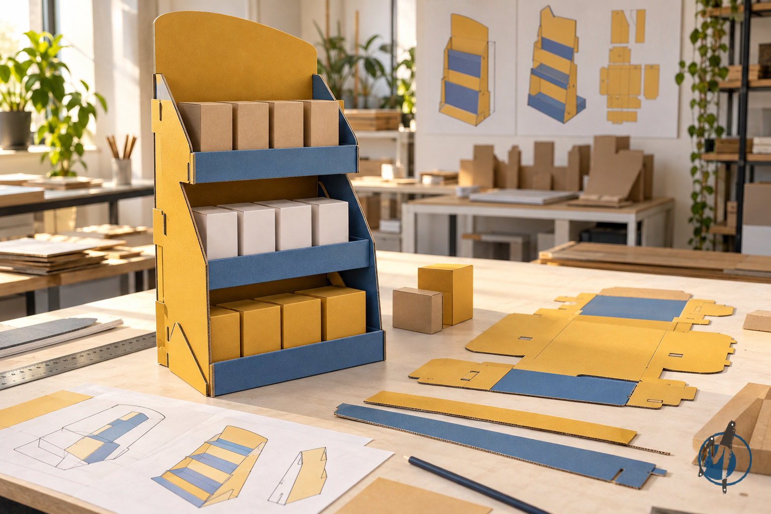
Build a structural prototype. Use a physical sample to assess product fit, shelf support, balance, access and assembly. Note where the prototype differs from proposed production materials.
Review artwork and print. Check dielines, bleed, folds, image quality, colour references, language accuracy and applicable disclosures. Keep essential copy away from vulnerable edges and joins.
Test a representative finished sample. Evaluate the structure, print, finish and attachments together. Check rubbing, adhesive performance and repeated handling where relevant.
Validate packing and instructions. Pack, unpack and assemble the unit as the receiving team will. Confirm component identification, protection and destination labelling.
Release, inspect and learn. Set production inspection criteria, verify delivered units and document feedback from installation before extending the rollout.
For a multi-location campaign, a pilot installation can reveal issues that studio reviews miss: a header hidden by lighting, a shelf clip incompatible with the fixture or a standee that staff repeatedly move. Define what the pilot must prove, then record changes before approving the wider batch.
How do you plan costs, packing and rollout across Indian stores?
Display cost is more than the printed unit. Structural development, samples, cutting, finishing, assembly, hardware, packing, freight, installation and replacement requirements can all influence the total. Compare proposals on the same scope and specifications. A lower unit cost may be misleading if it excludes protective packaging or leaves substantial assembly work to the store.
Distribution planning should begin during design. Flat-pack units can reduce shipping volume but may need clearer instructions and more staff involvement. Pre-assembled displays simplify some installation tasks but occupy more freight and storage space. The right choice depends on product fragility, assembly complexity and the receiving team’s capabilities—not a universal preference for one shipping method.
Make the rollout easier to manage
Create a destination matrix linking each store to its format, quantity and artwork version.
Assign clear identifiers to components and cartons, separate from shopper-facing graphics.
Include illustrated assembly instructions and a reference photograph of the finished setup.
Confirm receiving hours, storage arrangements and installation responsibilities.
Specify how missing components, damaged units and incorrect versions will be reported.
Plan removal and material separation before the campaign finishes.
Ask for production and delivery schedules against the actual scope rather than assuming a standard turnaround. Custom structures, multiple approvals, special finishes and distributed deliveries can affect the programme. For recurring campaigns, retaining an approved structural format and updating selected graphic panels may reduce redevelopment effort, provided the new products and loading conditions remain compatible.
How can you measure effectiveness and avoid common mistakes?
Decide what success means before installation. Sales can be an important outcome, but display performance also depends on stock availability, price, promotions, store traffic and placement. Comparing a campaign period with an unrelated earlier period does not isolate the display’s contribution. Where practical, use comparable stores or time periods and document other changes that could influence the result.
Operational measures are valuable because they explain why a display succeeds or struggles. Record whether the unit was installed correctly, whether the intended stock was available and whether the message stayed visible. Store photographs and staff feedback can reveal blocked products, damaged shelves or replenishment difficulties that sales reports alone cannot explain.
Common mistakes to avoid
Designing before measuring: Attractive concepts may fail retailer approval or physically obstruct the store.
Using too many messages: Competing headlines make the main benefit harder to understand.
Ignoring partial depletion: A display can lose its visual impact or balance as products sell.
Approving only a render: Digital views do not establish structural strength or assembly usability.
Overcomplicating assembly: Unclear tabs and unlabelled components increase installation errors.
Covering useful information: Shelf talkers should not obscure prices, product identification or neighbouring merchandise.
Overlooking removal: An unsuitable adhesive can complicate window-graphic removal or damage a surface.
Making broad sustainability claims: Material names alone do not prove recyclability in the destination’s collection system.
For sustainability, prioritise practical decisions: right-size the structure, avoid unnecessary layers, design for disassembly and identify realistic recovery routes. Reusable hardware with replaceable graphics can be worth considering when collection, storage and repeat use are genuinely planned. Describe these specific features accurately rather than applying unsupported “eco-friendly” labels to the whole display.
How Messketeers can help: what should your retail brand do next?
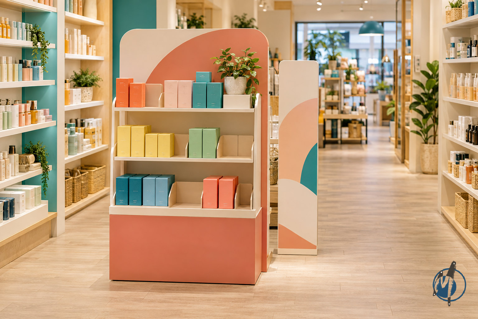
Messketeers’ Custom Print & Packaging Studio — Retail & Point of Sale offers counter and floor displays, shelf talkers and danglers, window graphics, and standees. For brands seeking point of sale display design, these formats provide a way to connect campaign visibility with practical product presentation across the store.
As an India-based creative studio working across brand identity, custom print and packaging, OEM stationery manufacturing, experiential decor and paper art installations, Messketeers can bring broader brand and material thinking to the brief. The aim should be a retail expression that feels consistent with the product packaging while respecting the different demands of a shelf, counter, window or promotional floor area.
Start with a focused project conversation
Share your product details, campaign objective, store photographs, available dimensions, required formats, quantities and launch date. Add retailer guidelines and brand assets if they are available. If the format is not yet decided, explain the shopping problem first—for example, low visibility at the shelf or a need to introduce a new product at checkout—so the discussion starts with function rather than decoration.
From there, establish the proposed design and production scope, required samples, approval stages and delivery responsibilities. A strong retail display is not just an attractive printed object: it is a coordinated tool that shoppers can understand, staff can maintain and the brand can deploy with confidence.
Frequently asked questions
What is the difference between POS and POP displays?
POS can refer specifically to the checkout, while POP generally covers places where shoppers consider purchases throughout a store. In practice, retail teams often use the terms interchangeably. A useful brief names the actual location, such as a billing counter, shelf edge or promotional floor area, and states whether the display must hold products.
Which display format works best for a small retail store?
The best format depends on available space and the shopper decision you want to support. Shelf talkers can highlight existing merchandise without taking floor space, while compact counter displays can present small products near checkout. Check retailer permission, product access and staff workflow before choosing a format; a standee is not automatically the most effective option.
What information is needed to design a custom retail display?
Provide the campaign objective, store location, available dimensions, product sizes and weights, required capacity, quantities, brand assets and launch date. Product samples and store photographs are especially useful. Also clarify retailer restrictions, language versions, assembly expectations and delivery destinations so the design accounts for both shopper communication and operational requirements.
How should a retail display prototype be tested?
Test it with actual products in the intended loading arrangement. Review stability, shelf support, product access, partial depletion and assembly. For a finished sample, also check print readability, folds, attachments and handling wear. Packing and unpacking should be tested separately, because a display that performs well in-store can still be vulnerable during distribution.
Can one display design be used across multiple stores?
A shared design can work across stores when fixture dimensions, permissions and operating conditions are compatible. Where they differ, create a coordinated family of formats rather than forcing one unit everywhere. Keep the brand hierarchy consistent while adapting footprints, attachment methods, artwork languages and stock capacity to each approved store environment.
How can a brand make retail displays more sustainable?
Reduce unnecessary material, select structures suited to the required service life and make components easy to separate after use. Consider reusable hardware only when collection and repeat deployment are realistic. Check local recovery options before making recyclability claims, and account for coatings, adhesives and mixed materials rather than judging sustainability by the main substrate alone.