 Messketeers
Brand Identity Design Agency for Startups: A Guide
· 12 min read
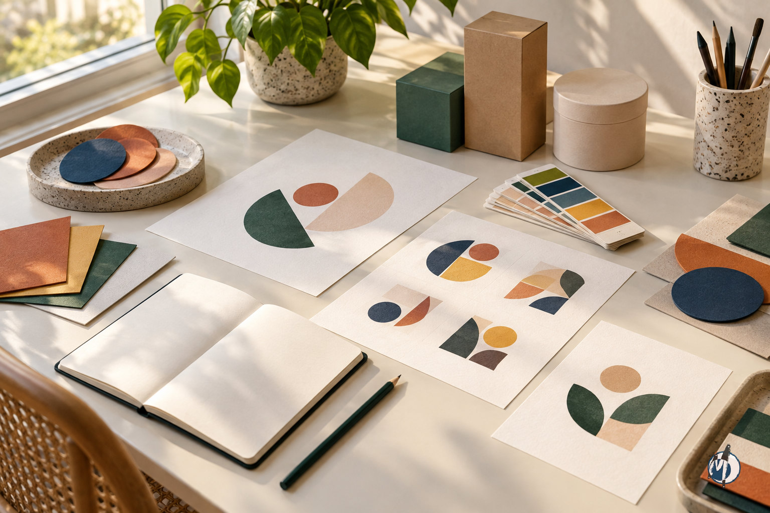
Quick answer: A brand identity design agency for startups turns a business’s positioning into a recognisable visual system: a logo, colour palette, typography, iconography, patterns and usage guidelines. The right partner designs for the places your brand must work—from a mobile screen to printed packaging—and gives your team practical tools to use that identity consistently. Choose an agency for its strategic thinking, production knowledge and quality of handover, not just an attractive portfolio.
What does a brand identity design agency for startups actually do?
A brand identity agency builds the visual language that helps people recognise and understand your business. It connects decisions about audience, positioning and personality to concrete design choices. For a startup, that connection matters because early touchpoints often appear separately: a pitch deck today, a website next month, and product packaging later. Without a shared system, each can accidentally present a different company.
An identity is more than a logo. The logo is an important identifier, but colour, typography, imagery, graphic devices and layout behaviour create much of the everyday brand experience. A distinctive marque paired with inconsistent fonts and unrelated packaging can still feel fragmented. A coherent system helps even a simple invoice or onboarding screen feel intentional.
The core visual identity deliverables
Logo and marque design: A primary signature, suitable variations and an identifying symbol where appropriate.
Colour and typography: Defined colour roles, readable type choices and a clear information hierarchy.
Iconography and patterns: Supporting visual assets with consistent construction and usage rules.
Brand guidelines: Instructions that help employees, freelancers and vendors apply the identity correctly.
Strategy, naming, copywriting, website development and packaging engineering are related but separate activities; do not assume they are included in every identity proposal. For Messketeers’ Brand Identity & Strategy — Visual Identity Systems service, the relevant offering covers logo and marque design, colour and typography, iconography and patterns, and brand guidelines. Your project brief should clarify how much strategic discovery and application design the engagement requires.
When should a startup invest in a complete visual identity?
Invest when you have enough clarity about your audience and offer to make informed design decisions, and enough visible activity for inconsistency to become costly. That might be before a public launch, during a move from pilot to commercial sales, or when entering a new distribution channel. Funding alone is not the deciding factor: the better question is whether your existing identity supports the business you are actually building.
A startup still testing fundamentally different products may need a lean identity rather than a comprehensive system. That does not mean careless design. It means prioritising a usable logo, a restrained palette, reliable typography and essential templates while postponing assets with no immediate purpose. Conversely, a product launching across ecommerce, retail and physical sampling needs broader application testing from the outset.
Signs that an identity project is timely
Different team members are creating visibly inconsistent materials.
Your current identity resembles competitors or misrepresents your positioning.
A logo that works online becomes unreadable on labels or small print.
Sales, hiring or distribution partners need a more coherent introduction to the company.
You are repeatedly paying vendors to reconstruct missing files or reinterpret colours.
Treat the identity as infrastructure, not a ceremonial reveal. A launch-ready system should solve today’s communication problems without hard-coding assumptions likely to change. For example, a startup planning several product categories may need a flexible naming hierarchy and colour logic, rather than a logo illustration tied to its first product alone.
How do you choose the right agency rather than just a good-looking portfolio?
Start by evaluating the agency’s reasoning. Ask it to explain how a visual decision answered a business problem, why an alternative was rejected, and how the chosen system behaves across different applications. A portfolio can demonstrate taste, but an explanation reveals whether the team can diagnose your situation rather than repeat its preferred style.
Look for evidence of systems thinking and practical execution. Request examples of identity families, small-scale logo use, typography hierarchies and guideline pages—not only polished mockups. For an India-based startup, relevant questions may include multilingual typography, local printing constraints, material availability and coordination with production vendors. These needs depend on your business; they should be discussed rather than assumed.
Compare working models against your needs
Evaluation point | Logo-only engagement | Visual identity system | Identity with production applications |
|---|---|---|---|
Main output | Logo files and agreed variations | Logo, colour, type, graphics and guidelines | Identity plus specified physical or digital applications |
Useful when | An existing system needs a narrow update | A startup needs a coherent launch foundation | The launch includes packaging, stationery or spatial touchpoints |
Main limitation | The team must build the supporting language | Application artwork may remain outside scope | More dependencies and approvals need coordination |
Key question | Who defines everything around the logo? | Which templates and tests are included? | Who owns artwork, proofs and vendor coordination? |
Questions to ask before appointing an agency
Who will lead the work and who will review it internally?
What discovery inputs do you need from our team?
How are creative routes presented, evaluated and refined?
Which applications will be tested before approval?
What files, usage rights and licences will we receive?
How are additional requests and post-handover support handled?
The best fit is not necessarily the largest agency or the broadest portfolio. It is a team whose process, communication style and delivery capabilities match your actual launch requirements. A clear proposal should make responsibilities and exclusions easy to understand before work begins.

What should be included in a startup-ready visual identity system?
A startup-ready system should be distinctive enough to build recognition and simple enough for a busy team to use. Every component needs a job. An elaborate pattern library adds little value if the team cannot choose a pattern confidently, while a modest set of well-defined assets can support many consistent applications.
The logo suite should account for different shapes, backgrounds and reproduction conditions. Depending on the identity, that may mean horizontal and stacked arrangements, a compact marque, reversed versions and one-colour artwork. Variations should solve genuine usage problems, not multiply options unnecessarily. Test the smallest important use case before approving fine detail.
Specify the supporting system
Colour roles: Identify primary, supporting and neutral colours, with digital and print references appropriate to the project. Note that specifications alone do not guarantee an exact match across materials.
Typography hierarchy: Define heading, body and supporting styles, along with licensing requirements and practical fallback fonts.
Language support: Check the required scripts and reading conditions; a Latin typeface does not automatically provide suitable Indian-language companions.
Iconography: Establish stroke weight, shape logic, corner treatment and legibility at intended sizes.
Patterns: Define density, cropping, colour combinations and where patterns should not compete with information.
Layout principles: Explain spacing, alignment and visual hierarchy so new materials feel related without being identical.
Accessibility and reproduction should be part of design approval, not last-minute repairs. Check contrast for intended text uses, avoid relying on colour alone to communicate meaning, and assess fine lines on the chosen print process. A light pastel palette may work beautifully as atmosphere while still requiring darker colours for readable text and functional interface elements.
What does a good agency process look like from brief to handover?
A reliable process makes decisions in a sensible order. It establishes what the brand needs to communicate before debating visual details, then tests the chosen direction before expanding the asset library. This reduces the risk of approving an attractive logo only to discover that it cannot support the product range or packaging format.
Agree on one client-side decision owner and a method for collecting feedback. Founders, marketing teams and product teams may all contribute, but the agency needs a consolidated response rather than conflicting instructions. Feedback is most useful when it identifies a problem against the brief—for example, insufficient readability or the wrong category signal—instead of prescribing an arbitrary colour change.
A step-by-step identity workflow
Define the business context. Document the offer, audience, priority markets, competitive alternatives and launch requirements. Identify what is settled and what remains uncertain.
Set strategic criteria. Agree on the intended positioning, brand personality and practical constraints. Use these criteria to evaluate the design later.
Audit the category. Review competitor conventions, visual similarities and potential opportunities for differentiation. Do not confuse looking different with being relevant.
Develop creative directions. Explore coherent visual routes that connect a central idea to logo, colour, typography and sample applications.
Select and refine a direction. Consolidate feedback, resolve weaknesses and check whether the system communicates the intended character.
Test real applications. Use realistic content, actual dimensions and relevant backgrounds. Include physical samples or proofs where production risk warrants them.
Document and hand over. Deliver agreed assets, guidelines, licensing information and file organisation, then walk the team through their use.
Ask the agency to identify approval gates and dependencies in advance. Copy, product names, packaging dimensions or stakeholder availability can affect the sequence. If an essential input changes after approval, the project may need rework; a good process makes that consequence visible rather than hiding it until delivery.
How should startups plan budgets, timelines and scope?
Plan from the required deliverables rather than a generic market price. An identity for a digital-only launch is not the same assignment as one involving several product lines, multilingual labels and physical installations. The work expands with strategic uncertainty, application complexity, the number of decision-makers and the level of testing required.
Ask for a proposal that separates the core identity from optional applications and production. This helps you compare agencies on equivalent terms and phase work without weakening the foundation. For general industry guidance, a focused identity engagement typically takes several weeks, while broader projects involving multiple applications or production coordination take longer. Treat that as orientation, not a promised schedule.
Budget and schedule drivers to clarify
Discovery depth and the amount of existing brand strategy.
Number and complexity of creative directions and refinement stages.
Logo variations, icon sets, patterns and templates required.
Typeface, photography, illustration or other third-party licensing.
Language versions and associated review requirements.
Print proofs, material samples, fabrication tests and shipping.
Stakeholder response times and final approval responsibilities.
Additional rollout support after the core handover.
Use a minimum viable identity plan if resources are constrained: protect the quality of the central system, then prioritise the applications that customers encounter first. Do not treat naming clearance, website build, printing or manufacturing as automatically included. Confirm fees, applicable taxes, payment milestones, usage rights and change-request terms in the written agreement.
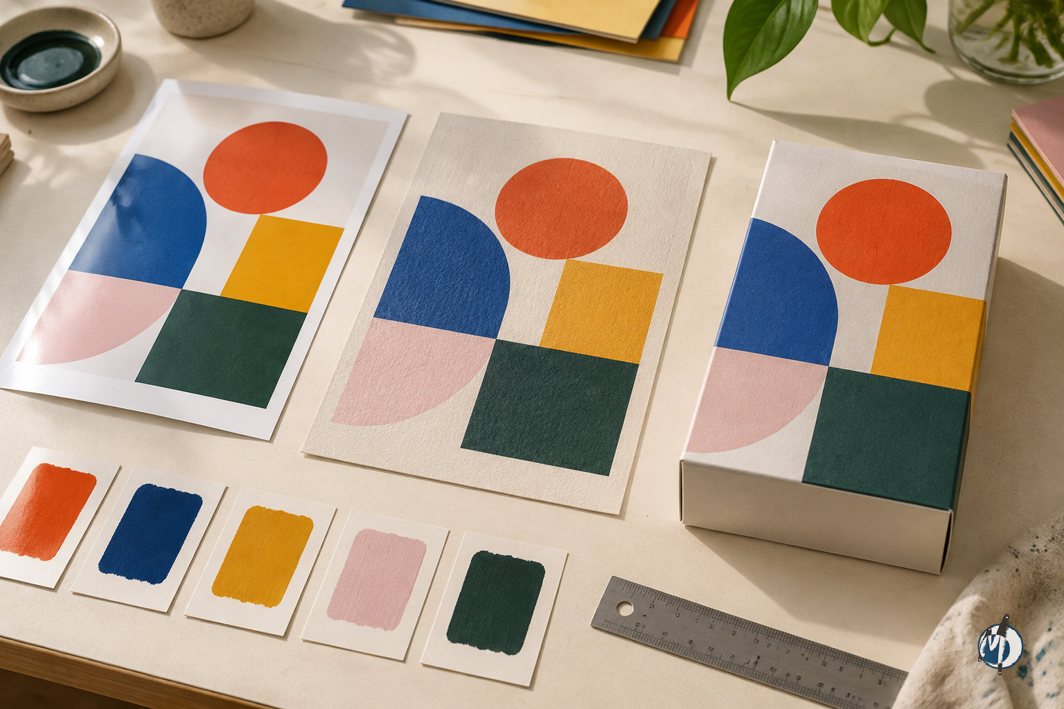
How do you make the identity work across screens, print and physical spaces?
Design for actual conditions rather than idealised mockups. A website header, a corrugated shipping box and a paper installation have different viewing distances, surfaces and technical constraints. The goal is not to reproduce every detail identically everywhere; it is to preserve recognisable relationships between shape, colour, typography and composition.
For print and packaging, review substrate, ink coverage, finishing and the production method with the relevant vendor. Colours can shift between a backlit display, coated stock and uncoated paper. A fine-line icon that looks crisp in a presentation may fill in or weaken in production. Physical proofs and samples help reveal these issues, although the required proofing method depends on the process.
Test the identity in meaningful conditions
Digital: Small profile images, responsive layouts, light and dark backgrounds, and accessible text combinations.
Packaging: Actual dielines, folds, seams, product information areas, and barcode or label placement.
Stationery: Writing surfaces, practical margins, one-colour reproduction and repeated manufacturing consistency.
Events and installations: Viewing distance, structural feasibility, lighting, assembly and how people move through the space.
For Indian startups, language, customer context and distribution requirements may influence the hierarchy. A regional-language descriptor, marketplace thumbnail or retail label can demand a different solution from a founder presentation. Packaging compliance and trademark clearance also need appropriate specialist review; visual identity work should accommodate those requirements without being mistaken for legal or regulatory approval.
What mistakes should startups avoid, and what should they check before launch?
The most common mistake is judging the identity as a standalone artwork. A design may look impressive in a reveal deck yet fail when used with long product names, ordinary photography or dense information. Evaluate the system with realistic content and routine tasks, not just the most flattering presentation.
Another mistake is confusing distinctiveness with complexity. Recognition can come from a clear combination of shapes, type and colour rather than an elaborate symbol. Similarly, chasing a fashionable category aesthetic can make a startup look current while making it difficult to distinguish from competitors. Ask whether the identity expresses a meaningful direction that the business can sustain.
Common mistakes to avoid
Approving a logo before agreeing on audience and positioning.
Choosing creative work through personal preference alone.
Requesting more variations without identifying a functional need.
Ignoring font licences or assuming every collaborator can use the same licence.
Treating screen colours as guaranteed print results.
Allowing vendors to redraw logos or substitute typefaces without approval.
Launching without a shared source of final assets.
Pre-launch identity checklist
The identity reflects the agreed audience, positioning and personality.
Logo variations work at important sizes and on relevant backgrounds.
Typography is readable and supports the required languages.
Digital contrast has been checked for intended uses.
Relevant print applications have been reviewed with production partners.
Guidelines explain colour roles, spacing, hierarchy and incorrect usage.
Required editable files, exports and licence records are organised.
Trademark questions have been referred for appropriate professional review.
A team member owns asset access and future updates.
After launch, review consistency and usability rather than expecting the identity alone to prove commercial impact. Look for recurring vendor questions, avoidable artwork corrections and difficulties creating new materials. Sales and conversion depend on many factors; a useful identity system supports the experience but cannot substitute for product quality, clear messaging or distribution.
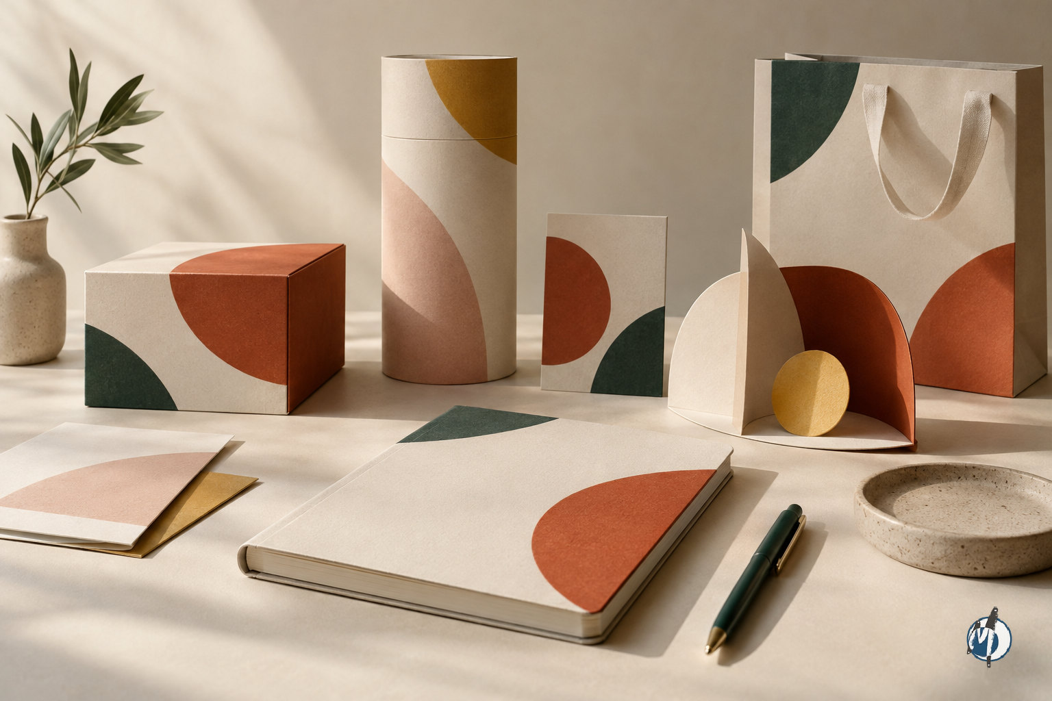
How Messketeers can help your startup build a coherent identity?
Messketeers is an India-based creative studio working across brand identity, custom print and packaging, OEM stationery manufacturing, experiential decor and paper art installations. That breadth is relevant when a startup needs its identity to extend beyond a screen into objects, materials and physical environments. It creates an opportunity to consider production and real-world application while shaping the visual system.
Within Brand Identity & Strategy — Visual Identity Systems, Messketeers offers logo and marque design, colour and typography, iconography and patterns, and brand guidelines. These components provide the foundation for a recognisable brand language. Where your launch also requires packaging, manufactured stationery or experiential applications, discuss those requirements explicitly so the scope connects the identity to the necessary execution work.
What to bring to an initial conversation
A short explanation of your product, audience and business stage.
Your current positioning, key messages and relevant competitors.
Existing brand assets and a description of what is not working.
The customer touchpoints that must be ready for launch.
Required languages, materials, formats and production constraints.
Your target launch date, budget parameters and approval structure.
The most productive starting point is a clear business problem: make a new offer easier to recognise, bring scattered materials into one system, or prepare an identity for physical production. Share that problem with Messketeers and define the essential deliverables together. The aim is not simply a new logo, but a visual identity your startup can use confidently as it grows.
Frequently asked questions
What does a brand identity design agency for startups deliver?
A visual identity engagement can include a logo suite, colour palette, typography system, iconography, patterns and brand guidelines. The exact scope varies, so confirm applications, editable files, licensing and handover support in the proposal. Naming, website development, packaging artwork and manufacturing should be listed separately if you need them.
Should an early-stage startup buy a logo or a complete identity?
Choose according to your launch needs and business clarity. A startup still validating its offer may need a lean but coherent foundation. A business launching across a website, packaging and sales materials benefits from a broader system. A logo-only engagement leaves your team responsible for defining the supporting visual language.
How much does startup brand identity design cost?
There is no useful universal price without a defined scope. Cost depends on discovery, design complexity, applications, licensing, testing and production requirements. Ask for an itemised proposal that separates the core identity from rollout work, printing and manufacturing. Compare equivalent deliverables and clarify revision terms, taxes and ownership before approving an engagement.
How long does a startup identity project take?
As general industry guidance, a focused identity project typically takes several weeks; broader application and production work takes longer. The actual schedule depends on scope, input readiness, stakeholder feedback and testing. Ask for a milestone plan showing approval gates, client responsibilities and the effect of changes after a direction has been approved.
Can the same identity work online and on packaging?
Yes, provided it is designed and tested for both. Digital use requires readable typography, appropriate contrast and small-scale clarity. Packaging adds material, print, finishing and structural constraints. A coherent system preserves recognition while allowing necessary adaptations, such as simplified marks or adjusted colour specifications for a particular production process.
What brand identity services does Messketeers offer startups?
Messketeers’ Visual Identity Systems offering includes logo and marque design, colour and typography, iconography and patterns, and brand guidelines. The India-based studio also works in custom print and packaging, OEM stationery manufacturing, experiential decor and paper art installations. Discuss related applications separately to establish the right scope for your launch.